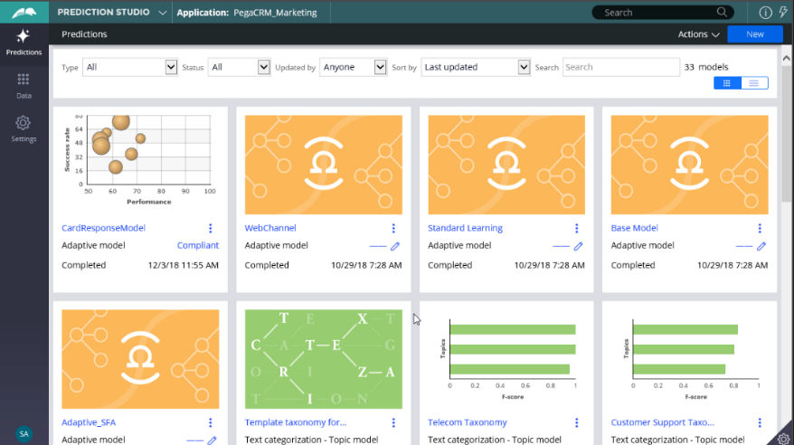
Inspecting adaptive models
Introduction
Data scientists monitor adaptive models regularly. In Prediction Studio, you can access all your adaptive models. On the monitor tab, the performance of the models is visualized in a bubble chart. You can drill further into each model. There are three available reports: predictors, score distribution, and the trend report.
Video
Transcript
This demonstration illustrates how to monitor the performance of adaptive models.
You can access all your adaptive models in Prediction Studio.
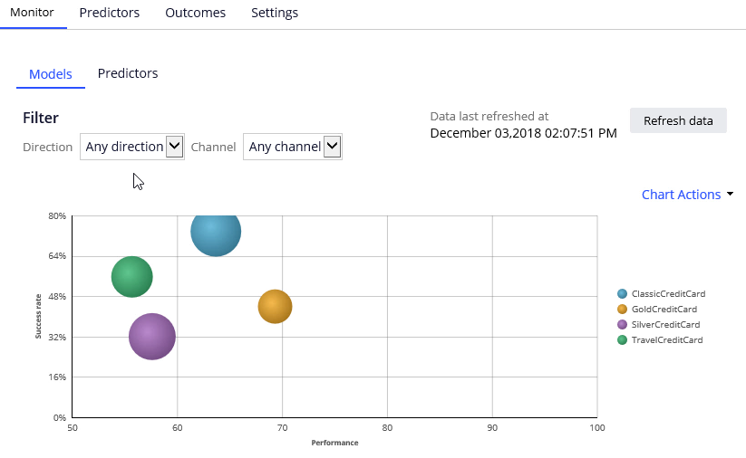
Let’s open the Card Response Model to see the available reports. On the Monitor tab, you can see the physical models that use the Card Response Model configuration. Each bubble represents models for a specific action. The relative size of the bubbles represents the number of responses captured for an action.
In this example, you have a model for every action belonging to the Credit Card group.
The model context includes the channel and direction, so you have different models for the CallCenter, Email and SMS Channels. As well as for the Inbound and Outbound directions.

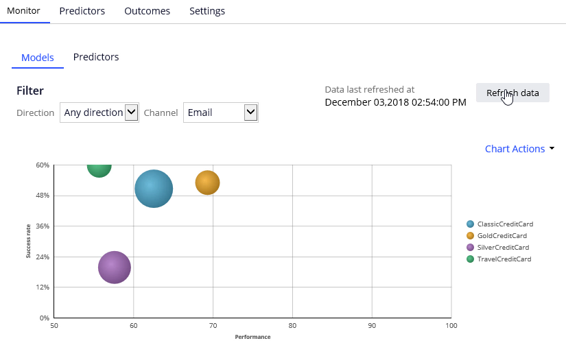
You can apply filtering to focus on models for a particular direction or channel, or a combination of the two.
The information you see here is extracted from the Adaptive Data Mart, which is a reporting view of the Adaptive Decision Manager (ADM) server. The Adaptive Data Mart is built automatically by a process running in the background. This process creates snapshots at regular time intervals. This means that the data as reported may be not the same as the data you see when you view it in real-time. You can synchronize the data using the Refresh data button.
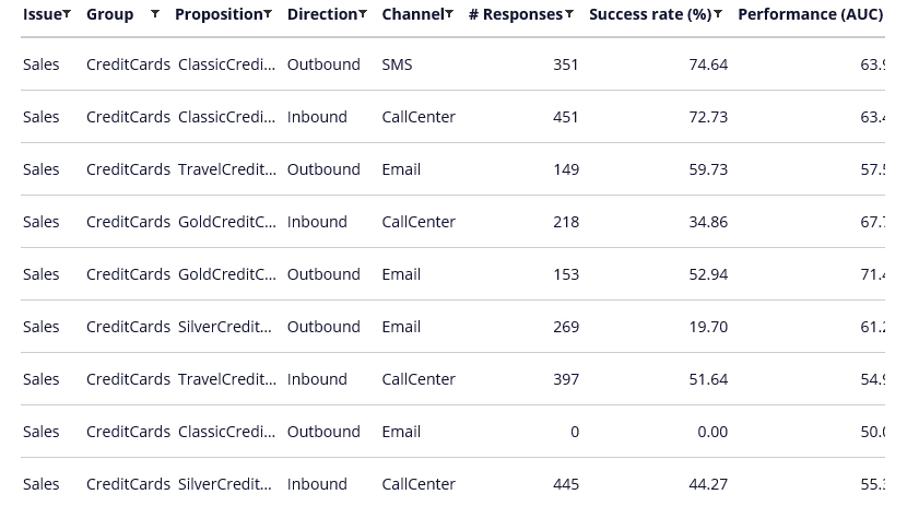
Here, we have retrieved the response data for the Classic Credit Card Outbound Email adaptive model.
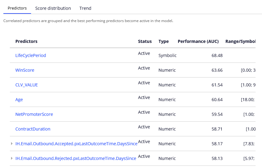
You can drill further into each model by selecting the Model report. There are three available reports: reports: Predictors, Score distribution and the Trend report.
In the Predictor report, you can examine the performance of individual predictors. Let’s examine a couple of them.
The best performing predictor is LifeCyclePeriod. This a predictor of type Symbolic.
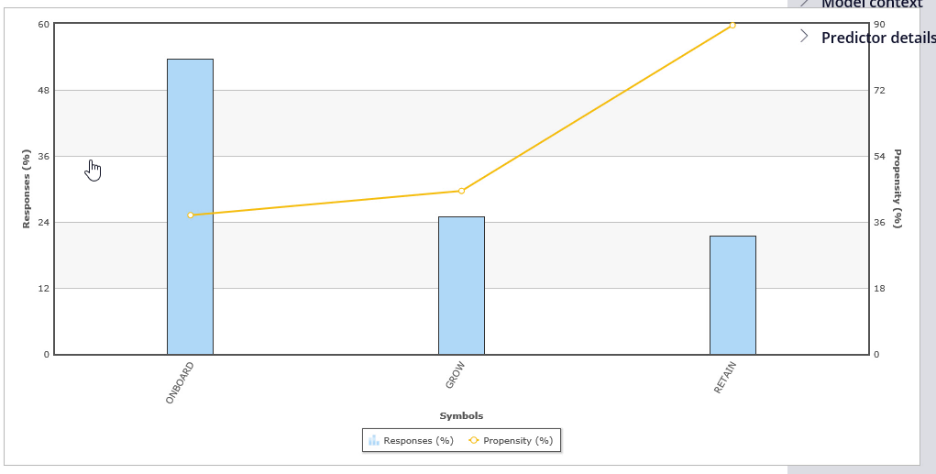
The individual predictor report shows that customer in RETAIN period is most likely to accept the Classic Credit Card action in the email channel.
Let’s now examine a numeric predictor.
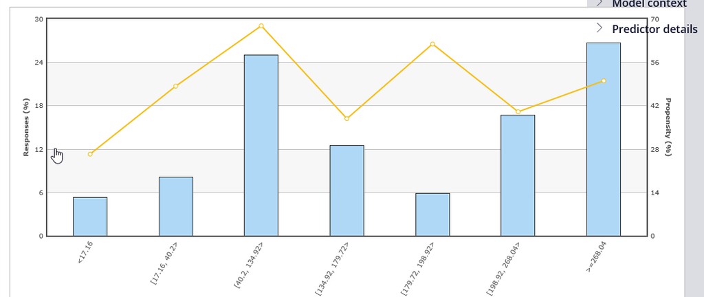
The system split the WinScore predictor into 7 bins. Each bin has its own offer propensity.
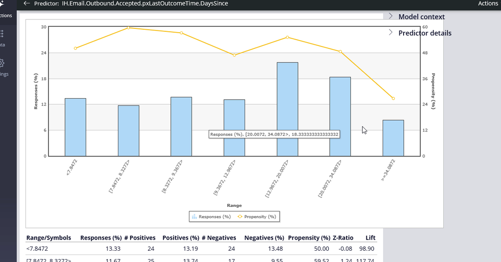
To further improve the predictive power of the models the system uses Interaction History summaries. In this example, the adaptive system established that the number of days since the last action was accepted is a well-performing predictor.
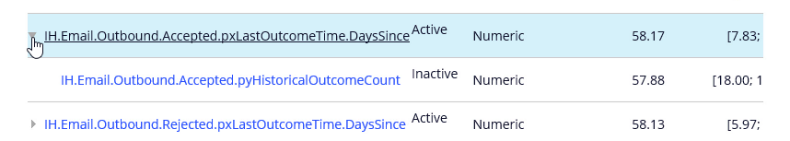
The system grouped two predictors with similar predicting performance. It then marked one of them as inactive. Inactive predictors are not used in the propensity calculation. In this model you have a number of inactive predictors. The system continuously monitors the predicting power of every predictor. If the predicting power of a predictor improves above a threshold that predictor will be activated. The reverse also applies. If the predicting power of a predictor drops below a threshold value that predictor is deactivated. The threshold value that determines when a predictor becomes active is set during model configuration. The default value is 52%.

The Score distribution report enables you to examine the propensity distribution for the whole model.
In the Trend report you can see the performance of the model over time.
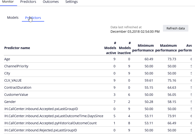
You can also examine the Predictor summary for the whole model. The Age predictor is used in all models and its predicting performance is between 60 and 73 percent. On the other hand, the Org_Key predictor is inactive in all models.
You are at the end of the demonstration which showed how to measure and monitor adaptive model performance.