Monitoring predictions
7 Tasks
15 mins
Scenario
U+ Bank has recently used Pega Customer Decision Hub™ to display a personalized credit card offer to eligible customers on their website. The bank now wants a report on the boost in success rate that the artificial intelligence (AI) generates. As a data scientist, you inspect the Predict Web Propensity prediction that aims to optimize the click-through rate of the web banners that contain the credit card offers.
Use the following credentials to log in to the exercise system:
| Role | User name | Password |
|---|---|---|
| Data scientist | DataScientist | rules |
Caution: This challenge requires specific artifacts. Ensure that you click Initialize (Launch) Pega instance for this challenge to get the correct exercise system.
Caution: The model data changes over time. The Predict Web Propensity prediction analysis in your Pega instance may include different data.
Your assignment consists of the following tasks:
Task 1: Inspect the control group settings
Inspect the settings for the control group by answering the following questions:
- Is the control group based on a customer attribute?
- Will the control group be large enough to measure the lift?
Task 2: Inspect the success rate graph
Inspect the success rate of the Control group and the Test group over time by answering the following questions:
- Is the success rate of the Control group stable over time? Is this expected?
- Is the success rate of the Test group higher or lower than the success rate of the Control group? Is this expected?
Task 3: Inspect the lift graph
Inspect the lift over time by answering the following questions:
- What is the current boost in the success rate that the AI generates?
- What is the trend of the lift?
Task 4: Inspect the performance graph
Inspect the performance of the AI by answering the following questions:
- What is the current performance of the prediction?
- What is the current distribution of the prediction?
- Which of the credit card offers have a low success rate?
Task 5: Inspect the propensity percentiles graph
Inspect the Percentiles graph by answering the following questions:
- What is the trend for the 90th and 10th percentile for prediction output?
- Is there a reason for concern?
Task 6: Inspect the propensity minimum/maximum graph
Inspect the performance history of the prediction by answering the following questions:
- What was the maximum value for prediction output 2 days ago?
- What is the current minimum value for prediction output?
Task 7: Inspect the propensity decile distribution graph
Inspect the propensity decile distribution by answering the following questions:
- Where does the Propensity decile distribution graph peak?
- Is there a reason for concern if the channel is outbound for this prediction?
Challenge Walkthrough
Detailed Tasks
1 Inspect the control group settings
- Log in as the Data Scientist with user name DataScientist and password rules.
- Click the Predict Web Propensity tile to open the prediction configuration.
- Question: Is the control group based on a customer attribute?
- Click the Settings tab.
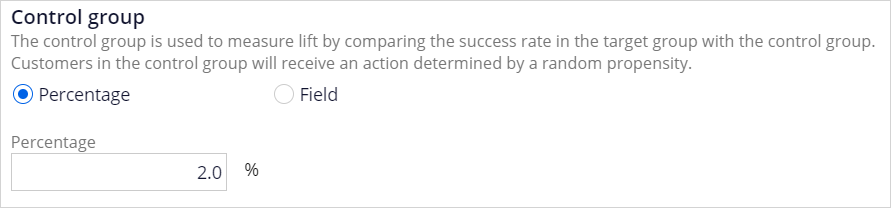 Tip: By default, the Control group is based on a percentage. Based on best practices, the Control group is set to 2% of the customers. Alternatively, you can base the Control group on a customer attribute by selecting the Field radio button.
- Click the Settings tab.
- Question: Is the control group large enough to measure lift?
Tip: In a web scenario, with high volumes of customer interaction, 2% is sufficient to measure lift.
2 Inspect the success rate graph
- Click the Analysis tab.
- Question: Is the success rate of the Control group stable over time? Is this expected?
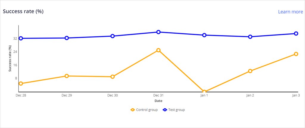 Tip: The success rate of the Control group is dependent on customer behavior and engagement policies, so it may change over time.
- Question: Is the success rate of the Test group higher or lower than the success rate of the Control group? Is this expected?
Tip: The success rate of the Test group is expected to be higher than the success rate of the Control group as the AI calculates which credit card offer has the highest likelihood of a click-through. The credit card offer is random in the Control group.
3 Inspect the lift graph
- Question: What is the boost in success rate that the AI generates over time?
- Inspect the Lift graph.
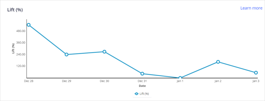 Tip: Hover over a date to display the lift.
- Inspect the Lift graph.
- Question: What is the trend of the lift?
Tip: Because U+ Bank implemented Pega Decision Management recently, there is not yet enough data to detect a trend. Once sufficient data is collected, the system generates notifications when there is no lift, or when the lift drops significantly.
4 Inspect the performance graph
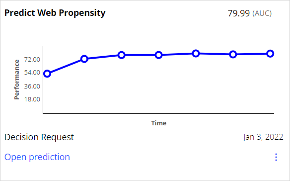
- Question: What is the current performance of the prediction?
- Inspect the performance graph.
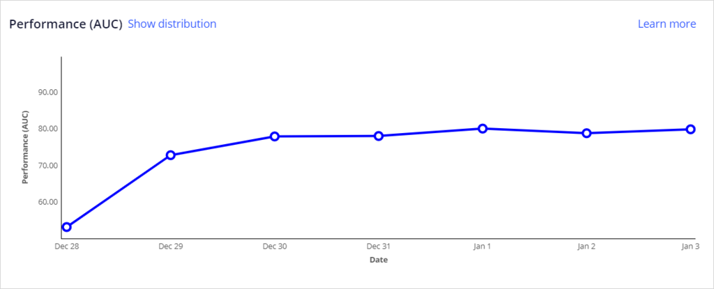 Tip: Hover over a date to display the performance. The current performance is also shown in the upper-left corner of the graph.
- Inspect the performance graph.
- Question: What is the current distribution of the prediction?
- Click Show distribution.
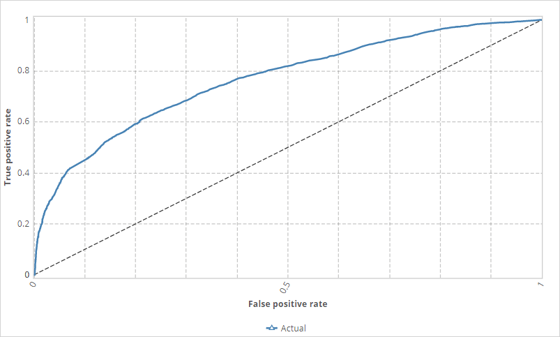 Tip: The distribution can be displayed as a ROC curve and a decile distribution for further inspection.
- Click Show distribution.
- Question: Which credit card offers have a low success rate?
- In the navigation pane on the left, click Models.
- Click the Web_Click_Through_Rate tile to open the model configuration.
- On the Monitor tab, inspect the performance graph.
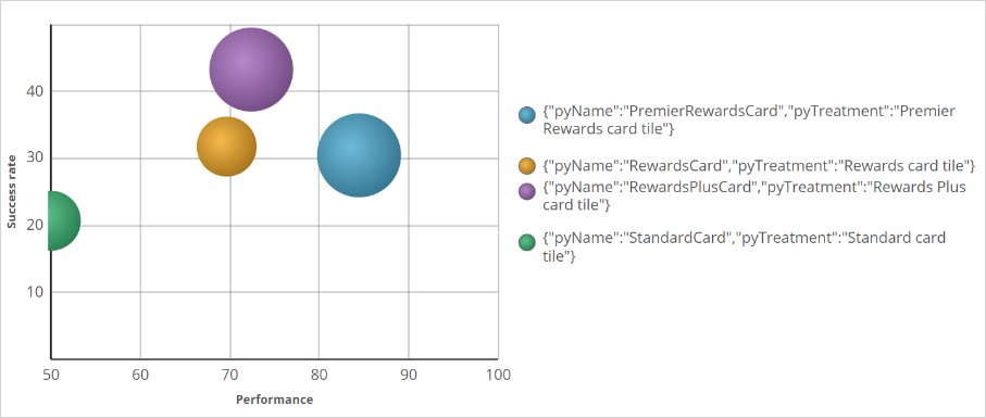 Tip: The green StandardCard has a lower success rate than the other cards. It also has low performance, and inspection of the predictors that the adaptive models use, which drive the Prediction, might improve the prediction lift.
5 Inspect the propensity percentiles graph
- What is the trend for the 90th and 10th percentile for prediction output?
- In the navigation pane on the left, click Predictions.
- Click the Predict Web Propensity tile to open the prediction.
- Inspect the Propensity percentiles graph.
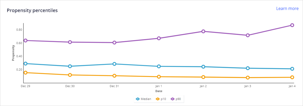 Tip: The lines do not show large fluctuations over time.
- Question: Is there a reason for concern?
Tip: Large movements of the percentile values are a reason for concern. In this case, the lines do not show major fluctuations.
6 Inspect the propensity minimum/maximum graph
- Question: What is the maximum value for prediction output from two days ago?
- Inspect the Propensity minimum/maximum graph.
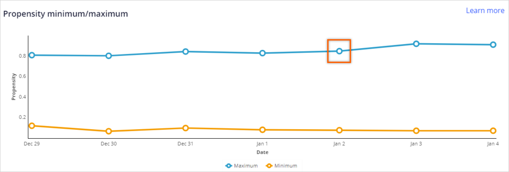 Tip: Hover over a date to display the value.
- Inspect the Propensity minimum/maximum graph.
- Question: What is the current minimum value for prediction output?
Tip: Hover over the current date over the Minimum line to display the value.
7 Inspect the propensity decile distribution graph
- Question: Where does the Propensity decile distribution graph peak?
- Inspect the propensity decile distribution graph.
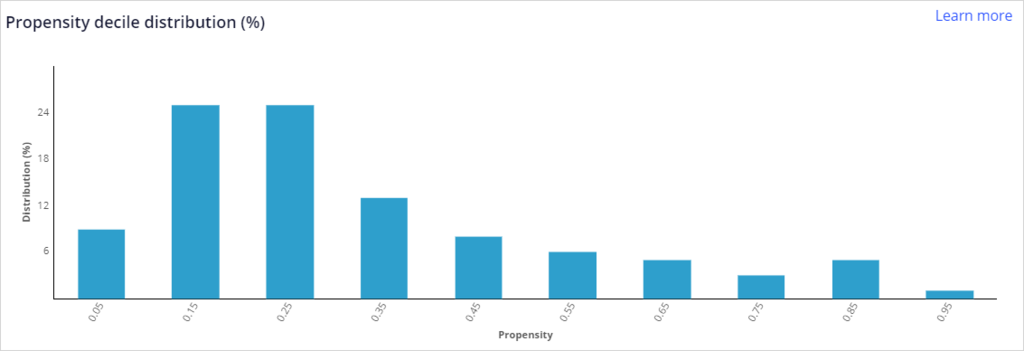 Tip: The graph peaks on the low end of the propensity range.
- Inspect the propensity decile distribution graph.
- Question: Is there a reason for concern if the channel is outbound for this prediction?
Tip: The Propensity decile distribution graph peaks in the low end of the graph. This peak is considered a good behavior for outbound actions. The graph also shows a long, decreasing tail towards the higher propensities, which means the model has received positive responses over time.
This Challenge is to practice what you learned in the following Module:
Available in the following mission:
If you are having problems with your training, please review the Pega Academy Support FAQs.
Want to help us improve this content?