Designing forms in Constellation
Forms are used in tasks and optional actions. Businesses use forms to collect the data that is necessary to achieve their goals. Well-designed forms help users complete work efficiently. Pega designers typically use the following guidelines for forms:
Guided workflow
With Constellation, end users are guided through tasks, which provide the right information at the right time within a workflow. When possible, you should group form inputs together in a logical order to keep the forms concise and focused. Be aware of cognitive load when users need to process information.
Form layout
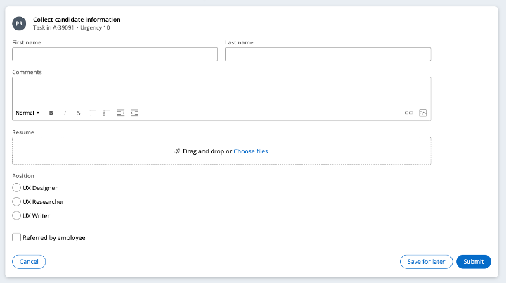
Constellation provides a default form template. The inputs that you add to the form will adjust to fit the layout accordingly. Simple inputs, such as text or a combo box, use a two-column layout. Wider inputs or inputs that can be of any height, such as rich text editor, text area, radio group, or checkbox, use a one-column layout.
The following image shows a default form template that adjusts layout based on input type:
Forms should not exceed more than two columns to support users with low vision. On smaller devices, forms are responsive and use one-column layouts.
Multi-step forms
Multi-step forms, or screen flows, allow users to work through complex tasks. A multi-step form represents a single task for a single user to complete. This pattern is useful when users need to complete forms in one sitting, especially if one or more steps have conditional logic.
As a guideline, avoid having more than seven steps in a flow. Otherwise, the process can become unmanageable or interrupted in that single sitting.
Forms with multiple steps might also display a form progress indicator.
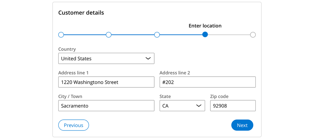
A typical multi-step claim form can include the following steps:
-
The contact’s personal information
-
Their current residential address
-
Their contact methods
-
A description of the purpose of the claim
The following figure shows an example of a multi-step form used to collect claim details:
Number of fields
Reducing the number of fields in a task can also keep users from being overwhelmed. Although it might not always be possible, as a best practice, use fewer than ten fields for each form.
Field helper text
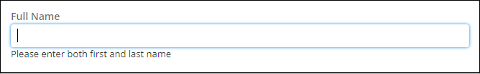
Form fields allow designers to provide helper text for each field. Helper text gives users additional instructions to help them accurately complete fields. Designers can also include references to case data to help end users make decisions faster.
The following figure shows a sample form field that offers in-line helper text:
Field requirements
Like all design systems, Constellation provides support for required fields. Failure to enter data properly causes an error.
The system automatically handles error management in forms, however, you might need to define the error messages and acceptance criteria for individual form fields.
Error handling
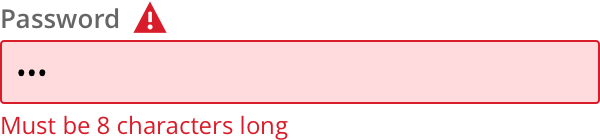
You should aim to prevent errors entirely. For example, you must not set a date field for scheduling future events that allows users to enter past dates. However, when users cannot avoid errors, provide clear error messages that explain the expected solution. For example, that their new password must be 8 characters long.
You can create validation logic that verifies inputs outside the normal flow of entry, in which case the server returns errors. Use validation logic for very heavy processes that cannot rely on client-side validation.
Pega supports the unique warning state for fields. You can use this feature for a situation that might become an issue. For example, if auto payment is being set up on a credit card with an expiration date too close to the current date.
The following figure shows an example of a clear and easily understandable error message:
Form component selection
Pega recommends a series of questions to help guide you toward the right form input for your design.
In the following figure, click the + icons to see the decisions that a designer must make to use the correct input in a form:
Dieses Thema ist im folgenden Modul verfügbar:
If you are having problems with your training, please review the Pega Academy Support FAQs.
Möchten Sie uns dabei helfen, diesen Inhalt zu verbessern?