Designing Insights
Insights
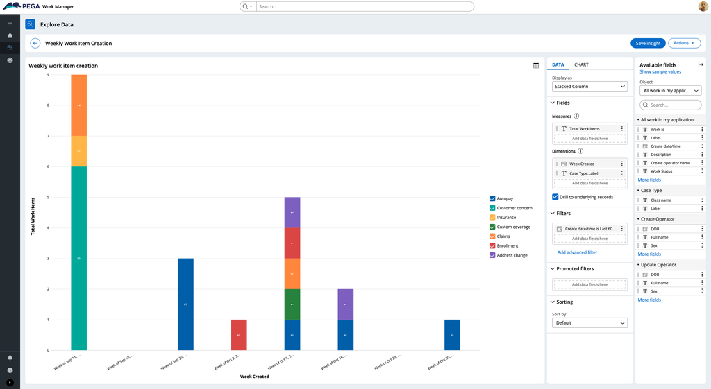
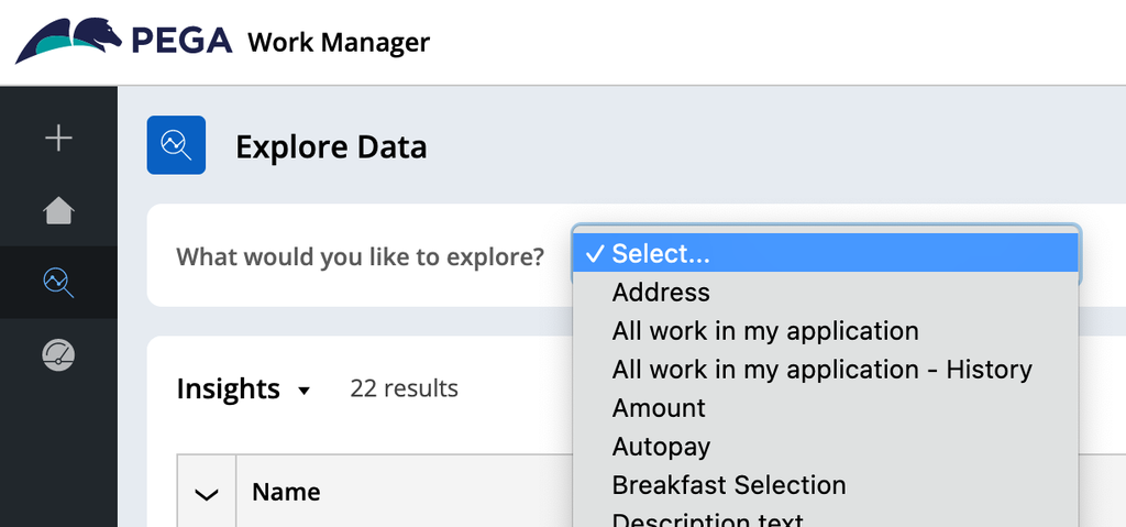
The Explore Data page allows you to create Insights - application data that provides you with meaningful information - in the form of tables, charts, or simple values.
To create an Insight, you can select which data to explore using the data panel. You can then sort, filter, and group the data so that it displays the information that is meaningful to your business.
For example, in the figure below, the user can access data on work items in an application. They can then display the work items created per week, per case type. The user can see this data in a variety of forms, including as a table, as a simple value, or as a column, pie, donut, or bar chart.
Configuring chart-based Insights
When creating chart-based Insights, you have the option to further configure how data is displayed. For example, you can add the following elements to a chart for easier data analysis:
- Grid lines to act as a visual guide when identifying data points
- Reference lines and regions to highlight specific chart values
- Conditional formatting to change the color of data that meets specific conditions
- Promoted filters to display filter options within the chart for quick filtering
Saving data as a personalized view
For easy access, you can save application table data that’s been pre-filtered, sorted, and grouped, as a personalized view. In this way, you can easily access this data again, to more quickly analyze it and create visualizations or charts.
Once you save a data set as a personalized view, you can access it from the title menu, as in the following figure:
Check your knowledge with the following interaction:
Dieses Thema ist im folgenden Modul verfügbar:
If you are having problems with your training, please review the Pega Academy Support FAQs.
Möchten Sie uns dabei helfen, diesen Inhalt zu verbessern?